Visual Analysis of Medical Cost Data
This analysis uses the Medical Insurance Cost Prediction dataset from Kaggle, containing 100,000 records with 54 attributes covering demographics, health history, and insurance details. The visualizations below explore relationships between household characteristics, healthcare utilization, and annual costs.
Average annual medical costs decline noticeably as household size grows. Single-person households face the highest costs, while families of five or more pay considerably less per person.
This pattern likely reflects how family insurance plans distribute premiums across multiple members, reducing individual costs. Larger households may also benefit from shared deductibles and out-of-pocket maximums.
Note: Because household size is recorded as discrete integers (1, 2, 3, etc.), standard correlation coefficients fail to capture this clear visual trend. The bar chart makes the relationship immediately obvious in a way that statistical measures alone cannot.
The relationship between annual premiums and doctor visits is surprisingly weak. Most policyholders cluster in a moderate premium range regardless of how often they see their doctor.
There's a slight tendency for higher visit frequency to correlate with lower premiums, which seems counterintuitive. This might indicate that preventive care plans or employer-sponsored coverage encourages regular checkups while keeping premiums stable.
The scatter pattern shows considerable overlap, suggesting that visit frequency alone doesn't determine premium costs. Other factors like plan type, age, or pre-existing conditions likely play stronger roles.
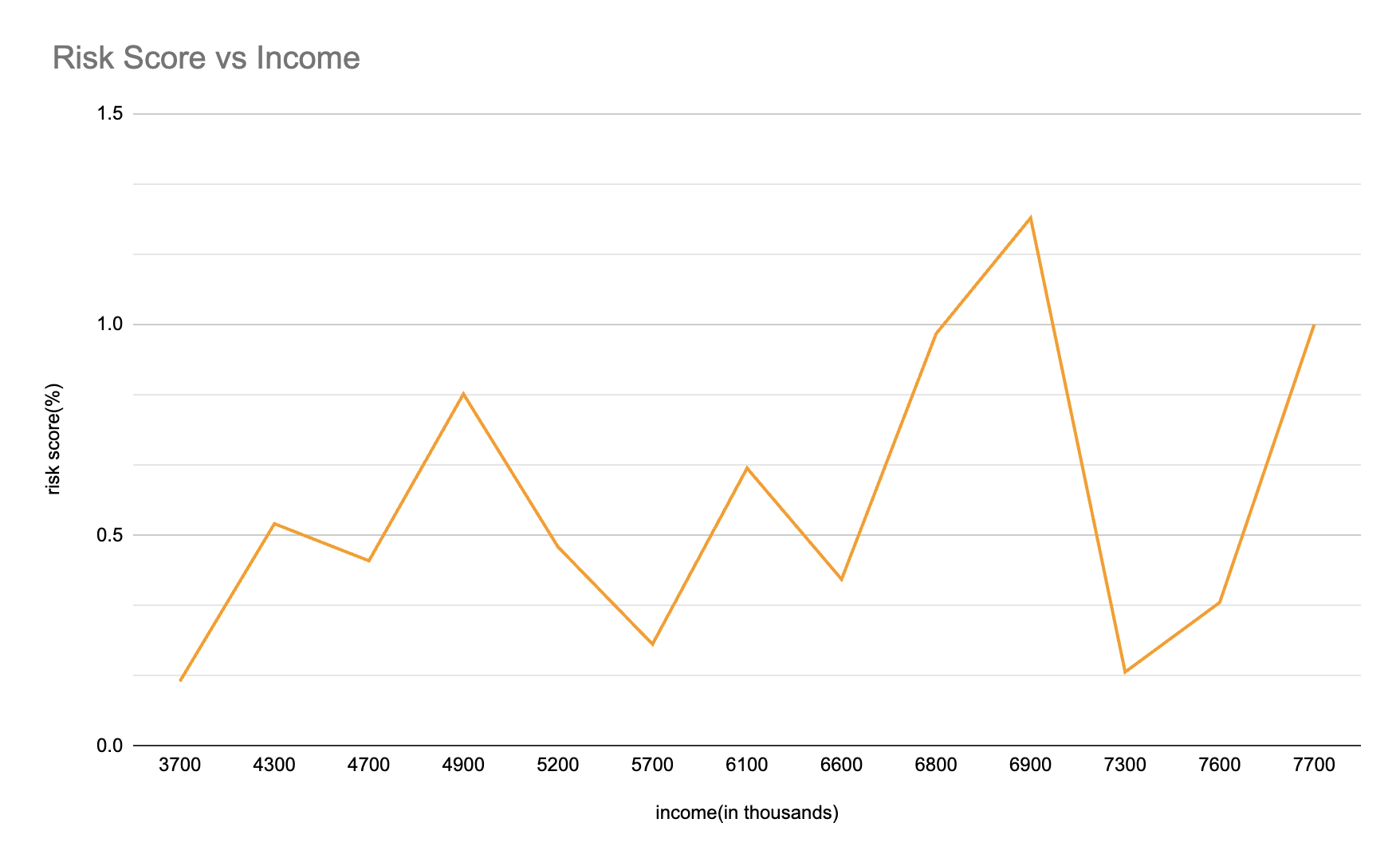
Risk scores show modest variation across income levels, with no strong linear trend. Higher-income groups display slightly elevated risk scores on average, but the relationship is inconsistent.
The lack of a clear pattern suggests that income doesn't directly predict health risk. Wealthier individuals may have better access to care, but lifestyle factors, genetic predisposition, and occupational hazards complicate the picture.
The fluctuation in this line chart highlights how multiple variables interact to determine health outcomes. Income matters, but it's far from the only factor—and in some cases, higher income correlates with riskier behaviors rather than better health.